Pages

As for me and my blog, we will serve the Lord.


Friday, June 15, 2012

Mother Sew Dear

That is the name of one of the Precious Moments figurines, and I always think of my mother when I see that one. As I’ve mentioned here before, she was quite the seamstress. She still has her Singer sewing machine, though she doesn’t use it now.

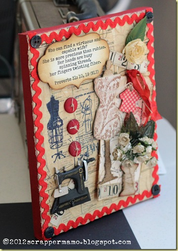
Multi-media art is very new to me, and though I am terribly inexperienced, I do enjoy my attempts. Recently I decided to “tackle” a canvas—sometimes there are too many elements for a tag! I had an 8x10 stretched canvas on hand and decided to make that the platform for a sewing theme project to take to Mother soon, hoping it will cheer her, in her illness.

IMG_2055 auto correct w watermark.jpg

First, I covered the canvas with gesso. I painted the edges of the frame with Making Memories Cranberry acrylic paint. Then I covered the canvas with Studio matte medium and laid an actual pattern down, scrunching it up to make wrinkles.

Then I stamped a couple of sewing theme impressions onto pattern material (using Ranger Archival Cobalt), gently tore the edges around the images, and used medium to apply them. I liked the double thickness of the pattern pieces, and so then tore strips of pattern and glued them down all over, as a collage. (Thanks to Marjie Kemper for sending me some authentic patterns to work with!) Probably the greatest challenge of the entire project was trimming the excess pattern material from the edges. I’m NOT a good cutter!

For the focal point of the canvas, I used a tag that I had made a few weeks ago, swapping out the flowers from the original tag (I was never happy with them). I added a flower from my stash, and I love the Wendy Vecchi sewing machine element. Thinking of the sewing notions Mother always had on hand, I added some measuring tape, buttons and ric-rac.

One of my favorite passages of Scripture is Proverbs 31, and the description of the “virtuous woman” in that reference well describes my mother. So, I pulled a portion of that reference that is relevant to sewing.

sewing canvas side view w watermark.jpg 

So, Mother, if you’re reading this, we’ll have to find a place to display this, next time I visit!

Wednesday, June 13, 2012

Compendium of Curiosities 2 Challenge – Technique #9: Time

pocket watch 2 w border.jpg

This week’s Compendium of Curiosities 2 Challenge at Linda’s Studio L3 involves the use of Tim’s pocket watch and the technique he outlines on page 35 of his CofC2 book. This week’s challenge is sponsored by Simon Says Stamp.

I opted not to get terribly creative with this one. I will use it in a project, maybe even a scrapbook page, but will go ahead and post the watch project itself at this point. This project begins with an empty watch case.

This is a subject that has been on my mind a lot lately—with the high school graduation of my two granddaughters and some other life happenings, I’ve just become more acutely aware of the passing of time, and of the accompanying memories.

Monday, June 11, 2012

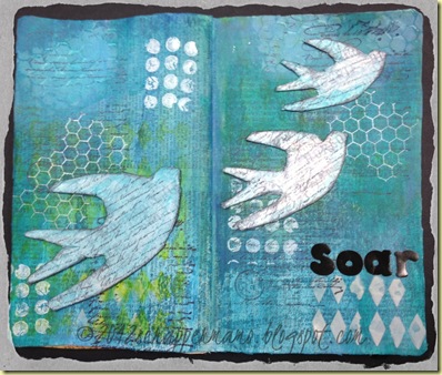
Art Journal Page – Soar

soar 2 w border.jpg

Taking inspiration again from Andrea Walford, I created this spread for my moleskin inspiration journal.

  • Masking tape in seam
  • Gesso
  • Tim Holtz Terminology Tissue Paper over all
  • Broken China Distress Stain over all
  • Paints: Claudine Hellmuth Studio Classic Teal and Sky Blue
  • Dylusions Spray Fresh Lime
  • Crafter’s Workshop stencil, used with stencil and with Golden Molding Paste
  • Tim Holtz Stamps
  • Birds, cut from cereal box, on Cricut, covered with TH tissue tape, gessoed and painted with CH Classic Teal, stamped with TH stamp, sprayed with Perfect Pearls

Tuesday, June 5, 2012

12 Tags of 2012 – June: Tinting Old Photo

June tag-tinting old photo w border.jpg

Though I’m not totally thrilled with my finished product, I do love anything that has to do with old photos. For such projects, I will always opt to use my own pictures. Through the years, I can imagine grandchildren asking, “Who is that?” and I don’t want the answer to be, “I got that picture from the internet—I don’t have a clue.” But then, when I create a project, I almost always am thinking about who will view it in years to come (truth is, no one may ever see it, but it makes me feel better to think that way, anyway)! Besides, I have SO MANY old photos, and I love them all, so why not use them in special projects!

This particular photo is one of my favorites. The twins in the old “wagon” or “stroller” are my mother and her twin sister (now 84). Their older sister, pulling the wagon, was 12 when they were born. The 28 represents the year the picture was taken. They were born in January 1928, and I believe they are less than a year old in this picture, so I’m relatively certain on the date of the photo.

The metal number 2 symbolizes the twins (of course).

I followed many of the suggestions on Tim Holtz’s blog. I used Bundled Sage and Broken China for the main colors for the tag and trimmings.

Saturday, May 26, 2012

Compendium of Curiosities 2 Challenge – Technique #7

bloom&grow w border.jpg For this week’s challenge at Studio L3, I had fun using my new Artistic Outpost stamps on the background created by using Tim’s technique, Brushless Watercolor, outlined on page 49 of his Compendium of Curiosities, Vol II. This week’s challenge is sponsored by eclectic Paperie.

I used one of Tim’s background stamps and Dusty Concord Distress Stain and Ink. I colored the AO stamped image with Distress Reinkers and a water brush. The ticket is one I created some time ago (I make those a strip at a time, using Tim’s ticket strip die, and then save them for use on tags as desired).

This one was fun and simple. Actually I often find those two adjectives go together for me. Sometimes I’m guilty of over-kill on my tags, and it is refreshing to make something clean and simple!

Friday, May 18, 2012

CC2 Challenge - #6 Tissue Wrap Collage

song in my heart2 w border.jpg

This week’s Compendium of Curiosities 2 Challenge at Studio L3 is using the Tissue Wrap Collage technique from Tim Holtz’s book, page 38. This one came together fairly easily for me, and I love working with the tissue wrap. The sponsor of this week’s challenge is The Funkie Junkie Boutique.

After deciding to use the Movers and Shapers hearts with the symphony tissue wrap, an old song came to mind (as a young girl I loved that old movie starring Susan Hayward—I know, I’m really old)—“With a Song in My Heart.”

The flower at the top is a Prima flower recently purchased at Hobby Lobby. The book text flower was cut from the Tattered Flowers die and inked with Black Soot. And I must say I am loving the Tiny Attacher!

Monday, May 14, 2012

Tim Holtz’s 12 Tags of 2012-May

sewing room tag 2 w border.jpg

Inspired by Tim’s May tag, this was a fun tag to make, and I didn’t mind buying a couple of supplies (Seamless Experience stamp set and Sewing Room die), as I can use them again for little projects for my mother to enjoy during her chemo. Since she was the CHAMPION seamstress as she was raising her five children (of whom I am proudly the oldest), I will use this theme more than once. She made almost all my clothes until I got married (as she did for all us four girls). She made my wedding dress and all the bridesmaids gowns for the wedding. For a time, she taught classes for Singer. So, I love this theme.

I will give credit to Shelly Hickox for the idea of using a stamp on sticky-back canvas for the dress form, but I must say that I had already purchased the die at a Hobby Lobby while traveling for our granddaughter’s graduation, to use in lieu of the stamp that Tim used (though I do have the stamp he used). I used my favorite Wendy Vecchi stamp for the pattern on the form, with Coffee Archival Ink. I cut the little dress for the hanger with Cricut Everyday Paper Dolls, using paper from October Afternoon. I stained the seam binding with Fired Brick. I stamped the spool stamp with Barn Door Distress Ink.

I found an old pattern on the internet and printed it on regular white tissue paper. I was hoping Mother had saved some of her old patterns (I remember Butterick and Simplicity and McCalls), but she says they have been gone for twenty years.

The really fun NEW thing for me was using the Melting Pot (recently purchased and used with beeswax already) and UTEE. It was so much fun, I kept trying to think of things I could dip in it! I had trouble finding paper flowers like I’ve seen on others’ projects, and the only thing I could find was some individual fabric flowers on stems in the wedding department at Hobby Lobby. They also had some leaves on wires.

closeup of utee flowers w border.jpg

I knew right away I would NOT be using the wooden spool (I don’t do woodworking, nor do I intend to), so I like the little spool that is part of the Sewing Room die set (cut from grunge board covered with natural sticky-back canvas and inked with Frayed Burlap and a bit of Barn Door). For my part, the next time I do a version of this tag, I will probably use flatter flowers, as I don’t like huge and heavy tags so much. But, I’m pretty much pleased with how this came together, and I’ll certainly be using UTEE again!

Friday, April 13, 2012

Compendium of Curiosities 2 Challenge: He Watches Over Me

cc2 challenge1 w border.jpg

I am playing along with the Compendium of Curiosities 2 Challenge on the Studio L3 blog.

Each week there is a challenge to make a project using a specific technique from Tim Holtz’s book, A Compendium of Curiosities Vol II. One of the sponsors of the challenge is Simon Says Stamp. I followed the instructions for the technique found on page 66 of Tim’s book, as the Challenge instructions specified.

I inked my stamp with archival ink and embossed with clear embossing powder. I cut a small flourish from a TH die and inked it with Dusty Concord, embossed with clear. I also used a stamp from TH Floral Tattoo and the cross stitch stamp from TH Spring Sprung.

The die that I chose to use for the project is the bird from the “Caged Bird.” It reminds me of a promise from Scripture that I am especially needing to remember today:

Matthew 10:29-31 (NIV)

29 Are not two sparrows sold for a penny? Yet not one of them will fall to the ground outside your Father’s care.[a] 30 And even the very hairs of your head are all numbered. 31 So don’t be afraid; you are worth more than many sparrows.

Tuesday, March 13, 2012

Art Journal: My First REAL Pages (Yay Spring in Missouri!)

Art Journal first pages

This day is delicious. It is warm and sunny, really feels almost like summer. It was winter here just a couple of days ago. Seriously.

I decided to start my “real” art journal today. My two previous “attempts” were following some prompts from an online class about doodling. This one today is me, just an expression of how I feel today (or at least as close as an art journal page can express…).

For my jounaling (art and otherwise), the page needs to reflect something about the meaning of the day, to me.

Art Journal first pages journaling For the background, I used my new Dylusional Spray Inks (five of them). On the pages you also see Faber Castell Markers, acrylic ink, stencils, oil pastels, water color crayons, and Hero Arts stamps. The book text represents the first time I have ever in my life intentionally “harmed” a real book. I have an old (as in my gifted teaching years, 1980’s) paperback of Lion, Witch and the Wardrobe. It is yellowed and in very bad condition. I like the idea of using book text, but it needs to (again) have meaning. I rationalized that recycling this book into art journal pages would really not be harming it, but rather would actually be bringing it back to life. Sounds good to me anyway.

Yes, I am out of my comfort zone. For one thing, this whole art journaling thing is very messy. I make a huge mess. And cleaning up the mess is not nearly as much fun as making it. But I must clean it up so that I can get to the table to make my next pages (I’m caught up with scrapbooking for now, you see).

Thursday, March 8, 2012

Art Journal Doodles-Trial #2

Week 2 Lesson Doodles Unleashed w border.jpg

This is my second attempt at a project, as I learn some techniques for art journaling from a free online class by Strathmore. This second week class was all about doodling with water color. Although I’m not thrilled with the output, I am learning some things about what will likely become “my style.” For example, I’m not so much about the spraying water everywhere. I do love water color crayons and love dipping the tip in water and then coloring. I’ll use that more.

I also like using my Faber Castell stamp markers. I still need to perfect the use of stencils, and I have some ideas to make that better next time (you can’t really see the attempts at stenciling here). I like stamping, so will use that more. I want to use words more, because I am basically a word person. I’m terrible with the India ink nibs but do pretty well with the “splatters”… ‘-)

Right now I am working on art paper, practicing as it were, for when I actually start the art journal.

Tuesday, March 6, 2012

Artistic Expression

First attempt at art journal

It’s downright funny to use that term (“artistic expression”) in reference to ME. In fact, if this post is being visited by a family member or close friend, they are double-checking the address for this link, as we speak. If there ever was anyone NOT artistic, that would be me.

But I am a journal-er. In previous posts I have shared about how many journals I have in progress at any given time. So when I heard the term “art journal” being discussed among some of my crafting friends, it was intriguing. As a result of some research into the idea, I am taking a free online class on art doodling, as I start to learn some techniques that I can use in an art journal.

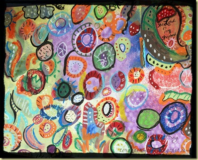
This is my first ever “art” project. When I was almost finished with the piece, I received a phone call that my mother-in-law had passed away (not unexpectedly). That’s when I added “The Lord is my shepherd” to the painting, to mark the significance of this piece.

On the work, I used various media: water color spray, oil pastels, acrylics, several kinds of markers, India ink, white gel pen, and more.

It is fun. I am a realist; I will never be good at this, but I can see how I can use this as a means of “artistic expression,”….yes, that COULD even be me!

Friday, March 2, 2012

2012 Tags--March Tag

12 Tags of 2012 March cornered pixlr

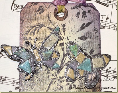
Making do with what I have—that was my theme for this tag, inspired by Tim’s March tag. I cut the butterflies on grunge paper on my Cricut (one from Paper Lace and one from Kate’s ABC’s). I ran them through the xyron and embossed them with American Crafts pewter powder.

The background stamp and the sentiment are from Wendy Vecchi’s Sentimental Art. I started with a manila tag and inked with Shabby Shutters, Tumbled Glass and Dusty Concord Distress Inks, using the same colors to dye all the lace and trimmings.

IMG_1283

The mosaic technique taught by Tim is quite lovely, I think, but it is very painstaking, clipping all those tiny snippets and then applying Glossy Accents over each one.

The butterflies reminded me of one of my favorite classical pieces from my piano lessons, Edward Grieg’s “Butterfly.” My International Library of Music, Book 3, always falls open to that page. I used it for the background for the photo.

Thursday, February 16, 2012

February Tag (for 12 Tags of 2012)

TH 12 Tags of 2012 Feb w border

This is my take on the Tim Holtz February tag. I started with a white tag, as I was a bit weary of the manila. (I cut the white tag on my Cricut, in Cricut Craft Room, using the Celebrations cartridge….I cut about 12 of them while I was at it!) I then applied Festive Berries (still my favorite for holidays) to the top side of the Valentine texture fades embossing folder and ran the tag through the Vagabond. I inked the edges of the tag with Walnut Stain.

Then I dyed some white lace and white seam binding with Barn Door Distress Ink, for the bottom border and the tie at the top.

I already had some extra foil tape cut, so I applied that on top of the lace border. I cut the grunge board Cupid from Love Struck, and the two grunge board hearts from the Mini Hearts set. I inked the Cupid with Barn Door and then coated him with a couple of coats of Xmas Red Stickles. The smaller heart I painted with Snow Cap Dabber and then applied Picket Fence Stickles. It wasn’t as sparkly as I wanted, so I added a coat of Stardust Stickles.

The box of chocolates from my husband (shown behind the tag) came wrapped in pretty red cellophane. I saved some of it and cut several layers of it with one pass, on the Vagabond (mini hearts die). I stacked them (glued with Glossy Accents) and placed them atop a grunge board heart that had been “ruffled” with the symphony tissue tape.

The little “I Love You” sentiment was computer generated (Typewriter font) and inked with Festive Berries.

The embellishments on the tie at the top are from my stash.

Tuesday, February 7, 2012

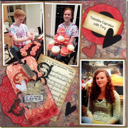
Valentine Theme Scrapbook Layout

USE L Page Canon2 strt and crpd in pse auto levels copy

Left Page of 12x12 two-page layout

USE Right Page iPhone PSE

Right Page of 12x12 two-page layout

I have always loved Valentine’s Day. Even though I was never very creative with my Valentine boxes at school, I always enjoyed seeing what the “other girls” created (there was always one, in every class, who could do incredible things with a shoe box…I was so envious). The Valentines I received in elementary school looked very much like the ones on the Tim Holtz background paper used on the Right Page here.

I used some pieces of Tim's Valentine stash to embellish the left page, adhering the pieces to grungeboard for dimension. On the right, the tag is one I made and posted a few days ago, with the plan to use it on a scrapbook page. The doilies (from my kitchen, for holiday serving) were inked with Festive Berries, and that is also the main ink used on the tag, because it happens to match our frosting color.  I scanned my “Love is a Many Splendored Thing” music, and printed it as a 4x6 photo on cream cardstock, then inked the edges with Gathered Twigs.

The hearts were cut using two dies: Love Struck and Heart Set (both mini movers and shapers). Some were cut from grungeboard and painted (gold and black paint dabbers) or inked. Some were cut from card stock. The collage music notes were cut from grungeboard that was first collaged with Tim’s tissue tape and then coated with Glue ‘n’ Seal and then partially inked (Vintage Photo).

tissue paper hearts Spending a day with my mother, baking cupcakes with my granddaughter, crafting with all my fun supplies, and making a scrapbook layout—a combination of some pretty special things from my life!

Friday, February 3, 2012

First Smash Journal Altered Cover

First Smash Journal

My first Smash Journal is almost full. Well, it IS full--more than, actually. But a few of the pages are not filled in, so I may still add some to it. I posted earlier how I had embellished the cover. I since pulled off a couple of the paper die-cut images and replaced with some of my new-found Tim Holtz-style goodies (grungy and vintage).  I like how it feels “me-ier” now.

Tuesday, January 31, 2012

Altered Clipboard + Inspiration

IMG_1058 Okay, I AM just a scrapbooker, but I guess I must admit to playing around a bit with “altered art,” although I still cannot think of anything I do as “art.” I was intrigued by a fellow ATT member’s altered clipboard and decided to try something similar.

Inspired by a book we are studying in our small group, The Me I Want to Be by John Ortberg, I have come to love the word “flourish.” Ortberg says that “flourishing means moving toward God’s best version of you” and he contrasts flourishing with languishing (none of us wants to do that!). I love the passage in Psalm 92:12-13: “The righteous will flourish like a palm tree….they will flourish in the courts of our God.” So, that was the “theme thought” I had in mind as I bought the $1.99 wooden clipboard and pulled some ideas out of the air.

I removed the metal clamp and primed the front of the clipboard with gesso. After it dried, needing a break from my fall and holiday project colors, I just started grabbing some Distress Ink pads that fit my mood that day (Broken China, Dusty Concord, Wild Honey and Faded Jeans). I just inked as the fancy hit me. After it dried, I pulled out some stamps that fit my thoughts and created a “stamp collage,” using Archival Black Ink for all the stamping.

I cut my theme word, FLOURISH, from cereal box, using the Storybook font, with the Cricut. I then cut the very same letters from a beautiful paper from Tim’s Lost and Found Paper Stash (found one that fit the ink colors I had chosen) and glued them to the cereal box letters. Then I covered all the letters with Clear Rock Candy Distress Crackle Paint, let dry, and then inked edges with Black Soot. I adhered them to the clipboard with Glossy Accents.

I had fun with the little embellies I attached through the hole in the metal clamp. I had two items to color with Alcohol Inks: the little chain (it was attached to a box of chipboard letters I bought about 4 years ago, and it was light green) and the large pearl bauble (from Tim). I mixed Wild Plum and Denim inks in a little zip-loc bag, to get just the shade of purple I wanted (to match the Dusty Concord distress ink).

I used Cricut Craft Room to weld the letters for the word GROW and then cut from grungeboard (yes, I use the Cricut to cut grungeboard). I then inked it with Dusty Concord, inked the edges with Black Soot, and covered it all with Clear Rock Candy Crackle Paint. I added another little bauble I had in my findings. I glued on a flower in keeping with the theme of flourishing and growing.

clipboard and book

My little white mini-legal pads that I love to use will fit just right, and I will be taking the clipboard with me to small group tonight!

Sunday, January 29, 2012

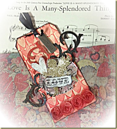
Valentine Tag for Scrapbook

tag from phone ed in pixlr Inspired by a project created by Shelly Hickox, I made a tag to use on the scrapbook page I will put together, with the photos posted earlier in “Cupcakes with Tory.” The Festive Berries Distress Ink exactly matches our frosting color!

I used a Cuttlebug folder to emboss the manila tag. Then I inked it lightly with Festive Berries Distress Ink. The cupid and heart are from Tim’s mini Love Struck set.

My least favorite thing to work with is glitter, and I should’ve stuck to my guns on that one. Not only is it a huge mess, but it never photographs nicely. I used Martha Stewart yellow gold glitter on the cupid, and on the heart I used her crystal coarse glitter.

The flourishes are cut from grunge paper, using Tim’s mini flourish die (love this one). Two of them I painted with the black paint dabber, and the other I painted with the Red Pepper dabber. I sanded them lightly after painting.

The trim at the bottom is colored with Festive Berries, and the ribbon at the top with Black Soot (both were originally white). I used music tissue paper and tissue tape behind the cupid. I sprayed the entire tag lightly with Heirloom Gold Perfect Pearls mist and then inked the edges of the tag with Black Soot.

The paper from Tim’s seasonal stash (behind the tag) will become the background paper on the scrapbook page. The sheet music is from my library (used many times through the years to play for weddings).

I am quite enjoying creating my own detailed embellishments for some of my scrapbook pages.

Monday, January 23, 2012

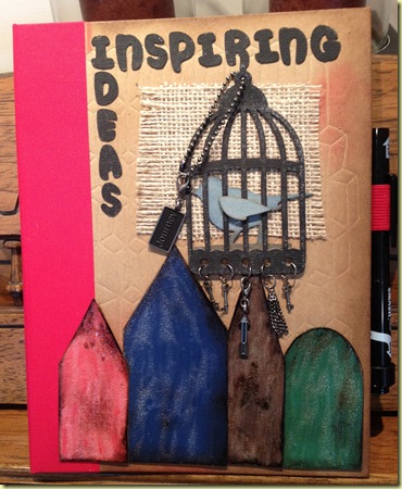
Second Smash Journal

Just bought a second journal, this one to use primarily for saving ideas for projects. I grunged it up a bit.

new smash journal

Friday, January 20, 2012

Tag for Opening Page of 2012 Scrapbook

New Year_s Tag

This tag was inspired by a beautiful New Year’s tag shared by Anita Houston.

Starting with a #8 manila tag, I sprayed it with Tattered Angels Glimmer Mist, Glacier (have had on hand for years but never used). After drying, I inked with Iced Spruce and Broken China distress inks. I stamped a few of Tim Holtz’s clocks and then heat embossed with white powder. I found some old transparencies for laser printers (from my teaching days) and printed a scanned copy of my music for “Auld Lang Syne” onto the transparency and adhered with staples. The sentiment is from one of Tim’s stamp sets. The border is cut with the Vintage Lace die on metal tape. The “ribbon” is twill tape, inked with Iced Spruce. I finished off with some metal embellishments and flourishes from my ever-growing supply of TH goodies.

Since most of my tags make their way onto scrapbook pages, I must be careful about being too “dimensional.” I think this one will work just fine!

Wednesday, January 18, 2012

Scrapbooks Caught Up!! Yay!!

2011 albums b

I scrapbook everything, and I take lots of pictures. So it’s necessary that I stay caught up, or I may never see the light of day. As of today, I finished 2011: two full Creative Memories 12x12’s and one 12x12 of our vacation. As an aside, I also have mostly filled my first Smash Journal—and my Prayer Journal is bulging this year as well! I was running a bit behind as of December, having joined the craze of learning and using Tim Holtz techniques (I even completed the 12 Tags of Christmas!!).

It’s a good feeling to be caught up! – Well, actually, I have three pictures ready for go for 2012, and the new CM albums should arrive tomorrow!

Monday, January 16, 2012

Family Christmas Digital Page

Most of my scrapbooks are traditional, paper. Occasionally I throw in a digital page, to put in a special album just for digital experiments.

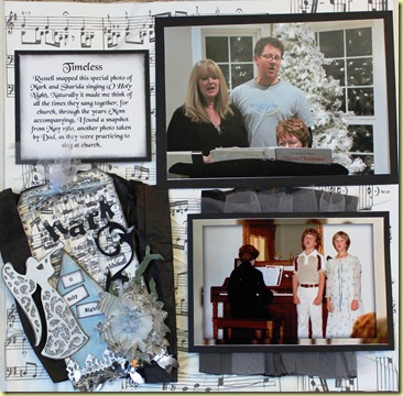
Timeless Memories Scrapbook Layout

IMG_1018

Left side of 2-page 12x12 layout

IMG_1008

Right side of 2-page 12x12 layout

As threatened, I finally completed the two-page layout using my Christmas pictures of singing around the piano, and incorporating a photo from 1980. I LOVE the pages, but it is SO frustrating to try to capture the “real” look in photographs! I have a great camera, but I just can’t capture the real thing. For example, the black behind the tag and the old photo is tissue paper (that happened to come in some packaging in the mail that day)—and the colors of the photos on the left side are not true, (they are much brighter in life), but changing those with editing software makes the background paper (Tim Holtz tissue paper) not a true color. Oh, well, the main purpose of the layout is NOT to take pictures of the layout!

For both pages, I first adhered plain white cardstock to my Creative Memories page (I use the spargo pages). Then I spread Studio matte glue all over the cardstock and scrunched up the music tissue paper. After stacking books on it as it dried, I then spread Picket Fence Stickles over the entire page. I gathered some tulle behind the old photo, giving it a rather “airy” look (in real-life).

This is much more “dimensional” than most of my pages—otherwise, I would never get an entire year in two 12x12’s, and that’s my goal this year.

Tuesday, January 10, 2012

“Hark” Tag for Scrapbook Page

I am in a holding pattern for scrapping my Christmas pictures, because I ordered the prints from Snapfish, and once again, the order is lost somewhere and not in my hands, after 12 days. Ugh!

But I have been working on a tag to use on one of the layouts, once the prints do arrive. I finished the tag today. It is based on one of this year’s 12 Tags of Christmas (Tim Holtz). The challenge for a scrapbook page will be to “smoosh” the tissue paper flower!

Hark Tag for Piano Singing Page

Friday, January 6, 2012

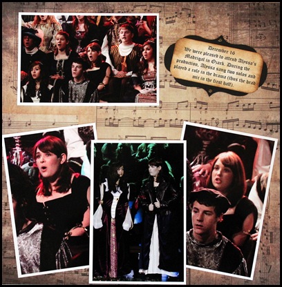
Scrapbook Layout-Alyssa’s Christmas Madrigal

Madrigal Layout Left Side ed Picasa

Left side of 12x12 two-page Layout

Madrigal Layout Right Side ed Picasa

Right side of 12x12 two-page Layout

Since the setting of the Christmas Madrigal was Medieval England, the vintage style seemed very natural for this layout (not that “vintage” and “medieval” are the same, but closer than contemporary and medieval!). I used paper from Tim’s Lost and Found stash, and it was handy to have a 6x6 portion of the music page to put onto a tag. I love the Christmas lamppost, and it was fun to incorporate it into this project.

There are more and larger pictures from the event in an earlier post, but I wanted to post this layout as a part of my journey to incorporate more creativity (via vintage techniques, for one thing) into my pages.

Our beautiful granddaughter Alyssa is the STAR of this layout! Can’t believe she is a senior, and this was her last Madrigal!

Wednesday, January 4, 2012

Scrapbook Layout-Conner’s Christmas Concert

SB Layout Conner's Winter Concert 2011

Inspired by Tag #2 of this year’s 12 Tags of Christmas, this layout provided the opportunity to experiment with bringing in “tag” elements and techniques onto a scrapbook layout. I used some of the beautiful music paper in the Tim Holtz Christmas Memories Kraft Resist Stash. Challenging it is, to get 7 photos on a two-page layout, and still leave room for some embellishments.

The photos for this layout are included in an earlier blog post. We were so proud of Conner, as he is in the top audition choir at his large high school, as a sophomore!